Navigation:
Synergy Outputs > Viewing Sensor Data > Graphical Data >> Utilities Bar Chart
Utilities Bar Chart

Contents
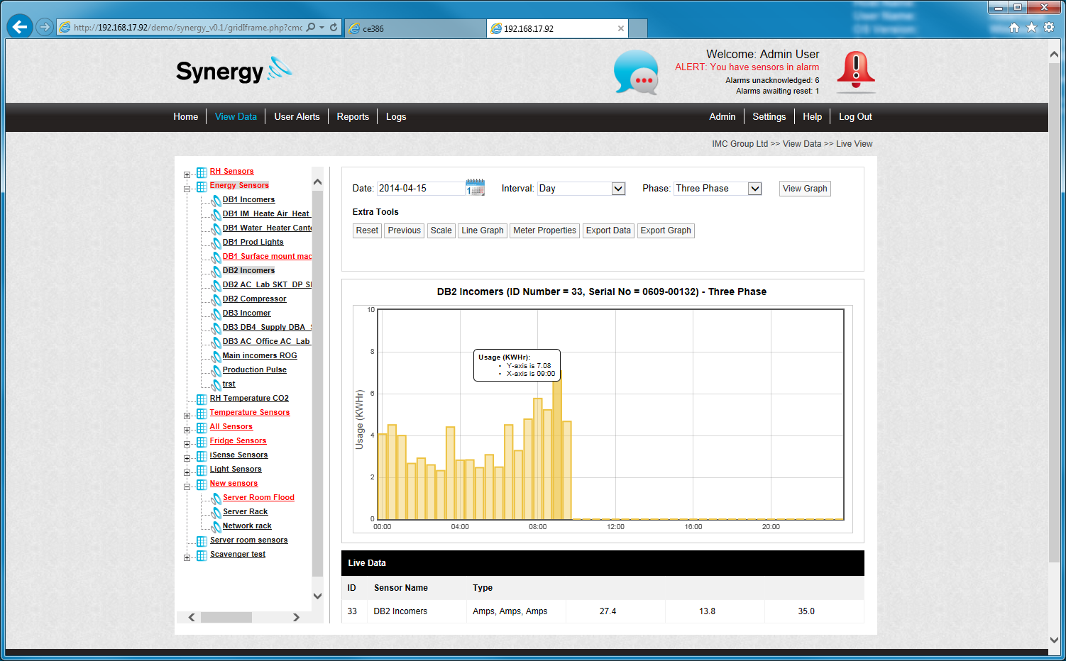
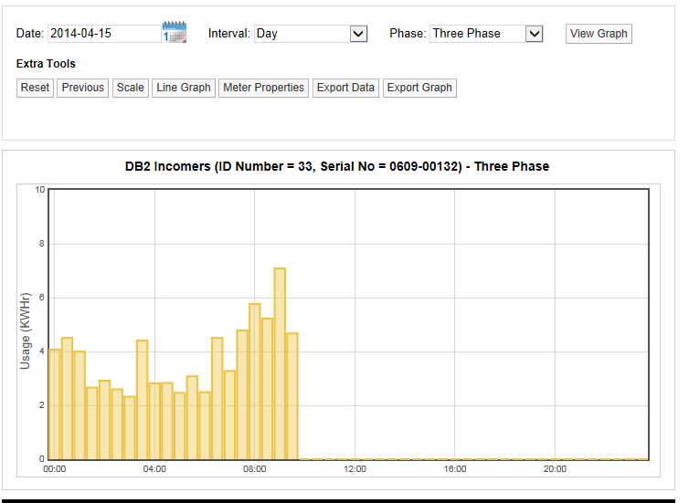
When a Current or Pulse Count Sensor is clicked, a Utilities Bar Chart is displayed in the Graph window, with options as shown in the Viewing Sensor Data section, showing the energy/water/gas etc. usage for the graph's time period. See Figure 542 below:
Figure 542
To view the usage during a specific bar period on the graph, hover the mouse pointer over the graph bar and the usage values will be displayed. See Figure 543 below:
Figure 543