
Contents
Synergy allows the User to access a Pie Chart displaying the percentages of sensor readings within a Zone that fall within or outside pre-defined ranges of values.
•Defining Pie Chart Parameters
1.Select Pie Chart View from the View Data menu on the top menu bar. See Figure 497 below:
Figure 497
2.Click on the required Zone's name in the left-hand Zone list.
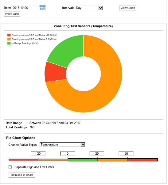
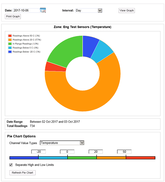
•A Pie Chart is displayed showing the percentages of sensor readings, associated with the selected Zone, that are within or outside pre-defined ranges of values. See Figure 498 below:
Figure 498
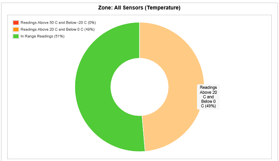
•Passing the mouse pointer over each segment will display a pop-up dialog box stating the percentage of sensors in the zone represented by the segment and the range of values it represents. See Figure 499 below:
Figure 499
Clicking on the Print Graph button saves the Pie Chart as a PDF and displays the following message bar. See Figure 500 below:
Figure 500

This message bar has the following buttons:
•Open
Clicking Open displays the chart as PDF in a new window.
•Save as
Clicking Save as (from the Save drop down menu) displays a Save As window enabling you to define where the Pie Chart is saved to and in what format.
•Save and open
Clicking Save and open (from the Save drop down menu) saves the generated PDF file and displays the chart in a new window.
•Save
Clicking Save saves the generated PDF file and displays the following message bar. See Figure 501 below:
Figure 501

This message bar has the following buttons:
•Open
Clicking on Open displays the current chart as a PDF in a new window.
•Open With (from the Open drop down menu)
Clicking Open With displays a window allowing you to select a different application from the default to open the PDF.
•Open Folder
Opens a window allowing you to navigate to and open a previously downloaded Pie Chart.
•View Downloads
Displays a View Downloads window allowing you to select and open a previously downloaded Pie Chart. See Figure 502 below:
Figure 502
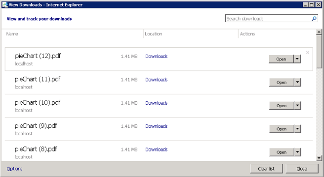
Either:
Click on Open to open the file with your default PDF reader.
Or:
Click on Open With (from the Open drop down) if you wish to open the PDF with another application.
•Clicking on the Clear List button in the View Downloads window removes all previously downloaded Pie Charts.
You can define the Pie Chart's representation of the Zone's sensor readings by editing the Pie Chart window's fields as follows. See Figure 503 below:
Figure 503
•Date:
Defines the start date for the sensor readings represented on the Pie Chart.
•Interval:
Defines the length of time over which sensor readings will be represented on the Pie Chart, starting from the date specified in the Date: field.
After making changes to these two fields, click on the View Graph button to display the Pie Chart with the new start date/time interval applied.
•Pie Chart Options
Figure 504
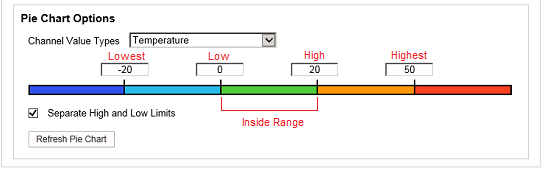
Channel Value Types
From the Channel Value Types drop down list, select the parameter (for example: Temperature, Humidity, Digital or CO2), monitored by the Zone's sensors, that you want the Pie Chart to represent.
Sensor Value Ranges
Enter values defining the Sensor Value Ranges the Pie Chart is to represent into the entry fields above the coloured bar. See Figure 504 above.
•Highest
Enter a value defining the absolute upper limit to conditions in the selected Zone into the entry field.
•High
Enter a value defining an upper limit to 'normal'/'acceptable' conditions in the selected Zone into the entry field.
•Low
Enter a value defining a lower limit to 'normal'/'acceptable' conditions in the selected Zone into the entry field.
•Lowest
Enter a value defining the absolute lower limit to conditions in the selected Zone into the entry field.
•Inside Rage
Acceptable values, the Inside Range, are defined as those between the High and Low values and are represented by the central coloured section.
| Note: | The red annotations on the above Figure are not shown in Synergy. |
Assign a Different Colour to a Pie Chart Segment:
Each segment of a Pie Chart can only have one colour assigned to it; to change the colour assigned to a segment:
1.Click on the Sensor Value Range of the coloured bar (see Figure 504 above) you wish to alter the colour of.
•The colour Palette Window for that segment is displayed. See Figure 505 below:
Figure 505
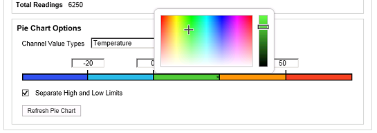
2.Click on the required colour from the palette on the left of the Palette Window and/or adjust the selected colour using the slider bar on the right.
3.Click on the Refresh Pie Chart button to apply the selected colour.
Separate High and Low Limits
When the Separate High and Low Limits box is ticked, the Pie Chart will be displayed with:
•One segment representing values above the Highest value.
•One segment representing values below the Lowest value.
•One segment representing values above the High value (but below the Highest value).
•One segment representing values below the Low value (but above the Lowest value).
When this box is ticked, the Pie Chart window could, typically, be displayed as shown in Figure 506 below:
Figure 506
When the Separate High and Low Limits box is not ticked, the Pie Chart will be displayed with:
•One segment representing values outside of the Highest and Lowest values.
•One segment representing values outside of the High and Low values (but inside the Highest and Lowest values).
When this box is ticked, the Pie Chart window could, typically, be displayed as shown in Figure 507 below:
Figure 507
Notice that, when the Separate High and Low Limits box is unticked, you can only select a new colour for the segments representing values outside the High/Low and Highest/Lowest limits from the right hand side of the coloured bar.
| Note: | After making any changes or additions to the Pie Chart Options, click on the Refresh Pie Chart button to action the changes. |